In Sencha Touch2, Tab Panels are a great way to allow the users to switch between several pages that are all in full screen. Each Component in the Tab Panel will have its own Tab, which get displays when tapped/clicked on the Tab Panel Icons. Tabs can be positioned at the top or the bottom of the Tab Panel, and can optionally accept title and icon configurations.
Today, we are going to see how we can dynamically add components to Tab Panels.
Define a Tab Panel
Let me define a Tab Panel with class name as 'MyTabPanel' which extends Ext.tab.Panel and alias is set to 'mytabpanel'.Using tabBar config, we are positioning the tab panel to display at bottom of the screen. defaults config property is used to set the common config properties that will share across all the pages in the Tab Panel.
Dynamically add Components to Tab Panel
In Controller Class, Using control config property we are attaching initialize event to the Tab Panel view component using id config 'tabpanel'. This event will fire onTabpanelInitialize() function when the Tab Panel is getting initialized/loaded on the screen.
Inside onTabpanelInitialize() function, we are initializing an array object which contains the list of container component that will be dynamically added to Tab Panel using add(). The array object contains 3 containers (home, about,contact) with config properties. By default, the first item in the Tab Panel will be on active state.
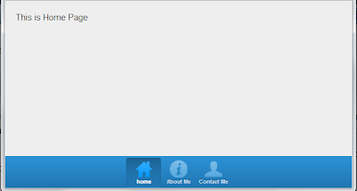
When i run this code in Google Chrome, Below is the output screen
Hope, you enjoyed this Post.
Today, we are going to see how we can dynamically add components to Tab Panels.
Define a Tab Panel
Let me define a Tab Panel with class name as 'MyTabPanel' which extends Ext.tab.Panel and alias is set to 'mytabpanel'.Using tabBar config, we are positioning the tab panel to display at bottom of the screen. defaults config property is used to set the common config properties that will share across all the pages in the Tab Panel.
Ext.define('MyApp.view.MyTabPanel', {

    extend: 'Ext.tab.Panel',
    alias: 'widget.mytabpanel',

    config: {
        id: 'tabpanel',
        itemId: 'tabpanel',
        defaults: {
           styleHtmlContent: true
        },
       tabBar: {
            docked: 'bottom',
            ui: 'light'
        }
    }
});
Dynamically add Components to Tab Panel
In Controller Class, Using control config property we are attaching initialize event to the Tab Panel view component using id config 'tabpanel'. This event will fire onTabpanelInitialize() function when the Tab Panel is getting initialized/loaded on the screen.
Ext.define('MyApp.controller.MyController', {

    extend: 'Ext.app.Controller',
    config: {
        control: {
            "#tabpanel": {
                initialize: 'onTabpanelInitialize'
            }
        }
    },

    onTabpanelInitialize: function(component, options) {

       var DynamicPanel = [
          {
          xtype:'container',
          title: 'home',
          iconCls: 'home',
          html: 'This is Home Page'
          },
          {
          xtype:'container',
          title: 'About Me',
          iconCls: 'info',
          html: 'This is About Me Page'
          },
          {
          xtype:'container',
          title: 'Contact Me',
          iconCls: 'user',
          html: 'This is Contact Page'
          }
       ];

       component.add(DynamicPanel);
    }
});
Inside onTabpanelInitialize() function, we are initializing an array object which contains the list of container component that will be dynamically added to Tab Panel using add(). The array object contains 3 containers (home, about,contact) with config properties. By default, the first item in the Tab Panel will be on active state.
When i run this code in Google Chrome, Below is the output screen
Hope, you enjoyed this Post.

hi, thx for the sharing.. but how to create form inside the dynamic panel?
ReplyDeleteMany thanks for this, saved me hours trying to figure this one out
ReplyDelete